


Title: Brand Identity (Formerly Brand Awareness) alt: Legally-mandated information would be printed on the back or discreetly along the bottom. In small letters under the nutrition information it would say "Like our products? Visit our website!" There would be no URL.
Hey everyone, this is the Society of Russell Crowe Film Supporters (SoRCFS) back again with a review.
So....I really have no idea what the hell Randall is going for here. For that matter, not a lot of people on the forums do, either. A lot of the posts I've read across the first couple of pages have gone something like this:
"PretentiousGuy wrote: Mkay it's not really that funny but I laughed at the alt text. But hey, here's [some example of a white label product]
It really is beyond me how they've managed to turn out 4 pages of posts mostly like this (or, failing that, just the second part).
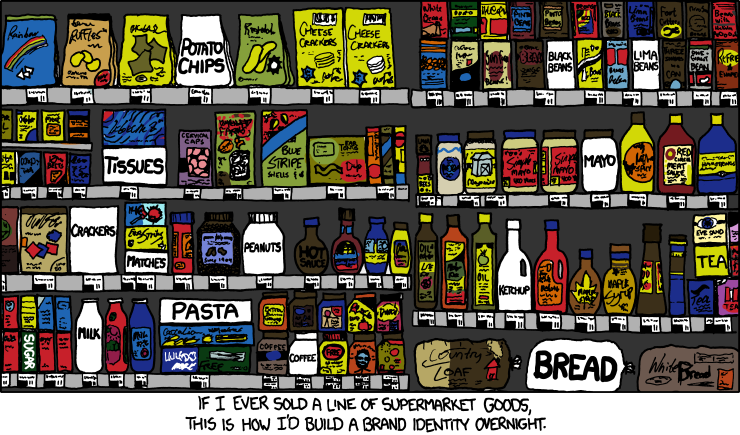
Is there much to say about this comic? No, not really. The only thing I really laughed at was the fact that Randall has apparently put his everything on one supermarket shelf. This including milk, which is generally supposed to be refrigerated. Also, second row down, a bit left of center: cervical caps. Because, you know, you absolutely have to put those in. It's totally not bad taste/irrelevant to the joke/more pointless seXKCD.
I'm going to do that thing where I criticize trivial parts of the comic composition now. If you really don't feel like reading this kind of stuff, then just know my general attitude towards this comic is that it's bland, and otherwise just plain out boring.
It took me a while to figure out that the comic was in color for a reason. Maybe it's just because I'm stupid, maybe because using white to contrast color here is a piss-poor decision. I mean, sure, I noticed the white label things right away (I'm not that stupid, apparently). But I cared a lot less because there were so many things to look at that the white label's uniqueness didn't hit me at first. If I was trying to tell this (admittedly bad) joke myself, I would sacrifice the bunches of objects for greater clarity. Here's some things I'd consider to achieve this goal:
- White stands out better against dark colors. Avoid light shades of grey.
- My audience reads left to right.
- I should try to place important things based on the rule of thirds or in the center.
That said, here's a five ten minute mockup of what I said above:
Clearer? I'd like to think so. Does it improve the joke any? No. Hopefully it does make it a bit clearer, though.
Eh, I'm done for now. There' not much to say and I feel like I'm forcing myself to blabber on pointlessly. Whatever.
Watch Man of Steel in 2013,
SoRCFS
Groving up in Sweden, the "Kooperativa Förbundet" (Cooperative Union) did exactly this. Here is a representative picture i found after googling for two seconds:
ReplyDeletehttp://fredrikedin.files.wordpress.com/2011/05/blavitt.jpg
The line of products was commonly referred to as "Blåvitt" (bluewhite), and all packaging was clean white with a blue square that held white letters that said exactly what was inside. No fancy names. In the picture we have, for example, "Laundry detergent", "Biscuits", Instant coffee, Brew cooffee, Toilet Paper, Loaf and so on.
Of course, the "Konsum" stores that sold these from the -40s and on or something did have other things in the stores, but the stores where all huge and contained mostly the white and blue generic boxes of products. Isles full of them.
This strip is a pretty strong indication that Randall has never been to a supermarket. Otherwise he would know that they never stock products of different brands on top of each other (like he did with the matches in this strip).
ReplyDelete"No name" brand has been around since the 1970s. Congratulations to Randall for inventing something that was around before he was born.
ReplyDeleteAnd the tissues. How has he forgotten?
ReplyDeleteIs there a reason that xkcdsucks isn't going to be updated anymore?
ReplyDeleteHe did it with damn near everything. I don't know where Randy shops, but I have never been to a grocery store where they just throw random shit on the shelves wherever it fits, piling as much as they can on there.
ReplyDeleteAnother thing I just noticed: Randall screwed up his brand identity with his sugar, hot sauce AND tea products. Either that, or those were made by other Randalls who had the same idea, but found out that the color white was already taken.
ReplyDeleteI think Mr. Xkcd has applied for a job at his local supermarket. He has obviously been thinking about applying his engineering skills to improving* bagging and stocking techniques. His comic is his CV.
ReplyDelete*By "improving," I mean "complaining about."
This would be way less jumbled and easier to see what's going on (though no more funny as sorcfs pointed out) if Randy had just gotten rid of all the products he didn't have in his "brand" as they are completely unnecessary. Randy also shows us why he isn't a graphic designer as the "normal" brands are all super ugly.
ReplyDeleteTo point out a small error, Randy forgot to color fill the areas underneath the bottle two to the right of the hot sauce as well as the handle of the ketchup(?) container.
Things almost exactly like that have been around at least since the mid-to-late 1970s (here is a real publicity photo from Jewel-Osco, circa 1977: http://4.bp.blogspot.com/_Ei2Ik5quiI0/S-92boFQk5I/AAAAAAAAD3s/PindkF82GvM/s1600/jewel+generics+1977+pleasantfamilyshopping.jpg) and there's too much lime green.
ReplyDelete