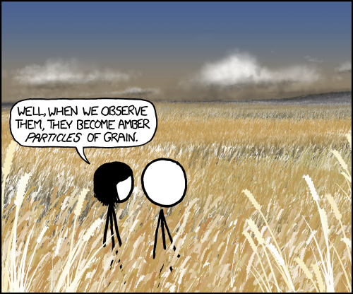
Raven said she wouldn't be able to get a review up until tonight, so, even though this comic doesn't really make me angry, I'll take over for now. I'm sure I'll find something to hate.
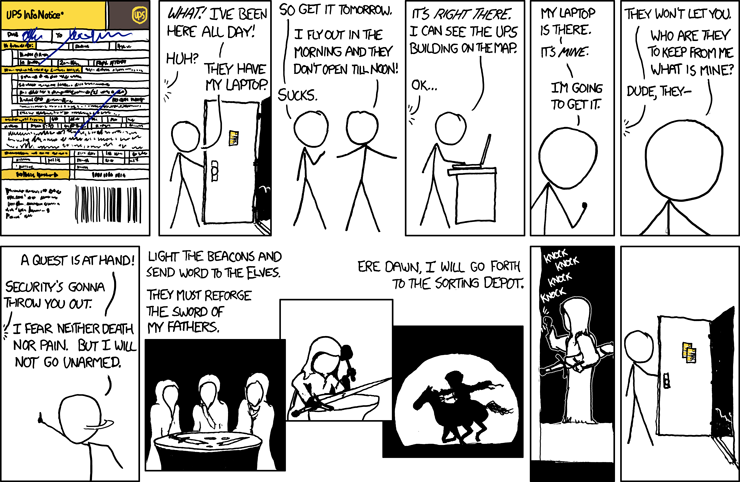 Title: Delivery Notification; alt-text: You can arrange a pickup of your sword in Rivendell between the hours of noon and 7:00 PM.
Wow, look at that! Color, shading, passable art in some panels? Which comic am I reading here? Oh. With the level of disconnection the guy's head has in panel 4, there's really no question. Yup, this is xkcd.
Okay, first complaint: The UPS form. I'm not sure how to feel about Randall free-handing it, since perfectly straight lines would sort of detract from the sketchy style of the rest of the comic. On the other hand, the bar code looks absolutely horrible, and there's obviously a pretty striking difference in art once we get to the elves. Okay, he should've used a freaking ruler.
Second complaint: Panels 6 and 7. This is unnecessary dialogue that exists only to set up the "elves make and deliver a sword" part of the strip. Randall SHOULD have expanded panel 5 to the end of the row, and had the guy saying, "The laptop is there. It's
mine. I'm going to get it." There would be a beat, then he would say, "I'll need a weapon." That would have the bonus effect of giving more space for the sword delivery panel, which feels cramped as it is now.
Third complaint: The forging montage. It's a nice arrangement of pictures, it's looks alright (for xkcd), and it successfully conveys the feeling of narration over an otherwise wordless scene. So what could possibly be wrong with it? The text. The freaking text. The pictures provide a nice flow. So what does Randall do? He ruins the flow by cramming two sentences above the first image and leaving the last sentence until the third image. And he doesn't even get that right! The first two sentences respect the borders of their image (although I think the second sentence could be fit in two lines). But the third? It overlaps the middle panel! It looks darn ugly. A caption for one image should NOT begin over another one.
Fourth complaint: Maybe I just wasn't paying attention, but I didn't understand the last two panels on the first read. I thought the guy had come back from his trip to the UPS depot, still sans laptop, and as his roommate opens the door for him, we see that UPS tried to drop off his package again and left another note. Can you blame me? It would be funny ("ha ha look at this tool get all worked up and then have nothing come out of it"), and we wouldn't have to explain away the fact that apparently elves use the exact same notification forms as the UPS.
If you haven't gotten it yet, the actual joke is that the elves tried to drop off the sword and no one answered, so they left a note. The alt-text (done right for a change!) helps explain this. And you know what? That's kind of funny! I like that, or rather, I like the concept. It's humorous and it's backed by tolerable art.
This could have been a good strip!But of course Randall, being Randall, ruins it! He spends too much time getting to the point, and by the time we wade through the miscues of excess dialogue and badly flowing text, the punch (and the joke) feel lost. As has happened so many times before, it feels like he had an idea ("what if the elves reforging Andúril couldn't deliver it") but wasn't sure how to set it up. What he settled on wasn't bad, but it could have been better.
Case in point. I see from the xkcdsucks comments that Raven's going to disagree with me, but I really liked Anon552's edit of the strip:
Maybe it's just because the edit changes the punchline to match up with what I originally thought Randall was trying to do, who knows. On the other hand, it gets rid of an unnecessary elf sideplot, clears up the ambiguity in the punchline, and hits a lot harder and faster than Randall's version. It's what 921 should've been.
Why doesn't Randall just get an editor already?


