Announcement

Died in a Blogging Accident has lived up to its name and died... in a blogging accident. That is to say it has concluded. You can still re-live the magic by clicking here to start at chapter 1. For genuine criticism of XKCD, please click the top link to the right (XKCD Isn't Funny).

Wednesday, July 31, 2013

Comics 1241-1245: The Good, the Bad and the Badly Drawn

Greetings. As you may have noticed I have changed the order of the reviews, just so it makes more sense for people scrolling down the blog,

Note: I said I'd post this 'tomorrow' but since the sun didn't actually rise here in Britain, I waited a day.

As always, hover over the images for alt text, and if you're using a mobile device, you'll just have to see it with your inner eye.

1245: 10-Day Forecast


Now this is a good xkcd. It takes an obviously absurd scenario, and connects it to something mundane like a weather site. This is in the same vein as great comics like Google Maps. A* for absurdism. Negative zip codes are a nice touch.

I like the way it escalates to more terrifying 'weather' each day, eventually leaving the godforsaken place with a forecast of nothing but static and darkness. It gets an A* for that. Perpetual Tuesdays are also a nice touch. And I'm sure some of xkcd's more devoted fans would agree that a land where were always Tuesday (a day that xkcd doesn't update) really would be a living hell.

D for the alt text, sponsored by Amazon.

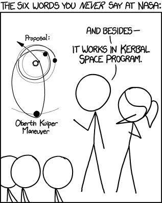
1244: Six Words

I didn't know what Kerbal Space Program is, until I looked it up to write this review. Apparently it's a simulation game, but I hadn't even heard of it. D- for standalone value. I should not have to look things up to enjoy my comics. I know Dresden Codak has defended this in the past...
The added bonus, for me, is that looking up new information like that is just as enjoyable as reading the strip itself. I’m not sure if everyone likes doing this, so I also try hard to make the comics readable without having to know every reference made, [...]  
(Source)
...but even he tries to make his comics readable to people who don't know the references. xkcd simply doesn't care. He's even mocked Penny Arcade for doing this, but he probably doesn't even realise he's doing it himself. So F for self-consciousness.

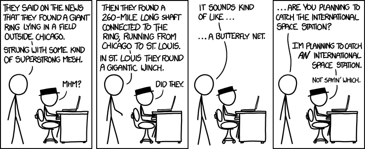
1243: Snare

Okay, this bothers me for two reasons. Black Hat is the sort of guy who trolls people by doing legal but annoying things, like using a mosquito buzz as his ringtone, or pretending to write a diary on a train (remember that?).

In comics like these (and some others) his classhole-ism is elevated to the status of outright supervillany, except that Black Hat would make a terrible supervillain because he never has a motive for anything.

This would have been a better comic if it had an actual supervillain character, like Dr Robotnik, or Lex Luthor, or heck even Tony from Real Life Comics. It actually sounds like something Tony would do. True, Tony almost never has a motive for being cartoonishly evil, but he's still a better character than Black Hat. Yes, I just said that Real Life Comics has better characterisation than xkcd. F- for characterisation.

And fuck you Randall for telling and not showing. You should SHOW, DON'T TELL when you're writing a comic about a megastructure designed solely to take down satellites, which might actually look pretty cool.

And forget what it's not showing for a second. They could be talking about anything, and the artwork would still suck. F-- for artwork.

Add another F for the clunky setup in the first two panels, none of which would be necessary if he DREW A FUCKING PICTURE. Jesus.

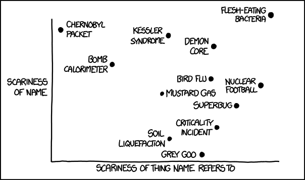
1242: Scary Names

What's wrong with this comic? I think 'nuclear football' sounds scarier than 'Chernobyl packet', or at very least equal, but our Good Lord Randall (No shit, that is actually what some fans are calling him.) seems to disagree with me. Mustard gas is halfway up the 'sounds scary axis', for pete's sake. C- for accuracy.

And if anyone dares tell me that this stuff is subjective, then I might as well revise my C- to a subjective F.

Also this comic probably set the record for the most people looking things up on Wikipedia due to an xkcd comic. I'll give it a B- for standalone value, since knowledge of those things is not essential to get the comic.


Lastly, do you feel he could have picked some better examples? I don't see 'blue waffles' on that chart. D for rigorousness of the examples.

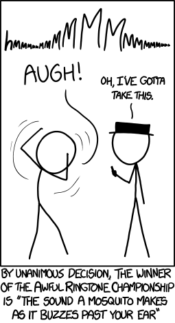
1241: Annoying Ringtone Champion

The joke? It might raise a smirk if it was told well. And the alt text added to it, so C.

D+ for artwork. It's unclear, really unclear. I would not have got the joke, or understood it in any way if it wasn't for the caption. the 'hmmMMMMmmm' is not a good onomatopoeia for the sound a mosquito makes. It is not clear that the sound is coming from Black Hat's phone. But that's to be expected given the material we got. It's a joke about a noise. I don't think there is a good way to tell it in a visual format, hence the +.

Also, the reason the buzzing mosquito is annoying is because it's right next to your ear, and therefore just about to sting you. The whole point is that you only hear it in one ear. A phone, no matter how good the stereo speakers are, cannot reproduce this unless it is right next to your ear. So F for realism.


No, there is no footnote here. A* (pronounced ay-star) is the British equivalent of A+, and we will now be using it here from now on.

Oh, and if you googled blue waffles, I am not sorry.

Monday, July 29, 2013

Comics 1235-1243: The Humour Quest

I am reviewing nine comics this week, because I felt like reviewing nine comics. Let's go!

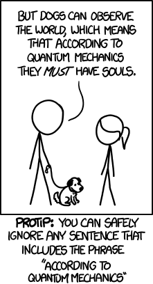
1240: Quantum Mechanics

When I read the read the text in the panel, I thought I could see where this is going. But the text below subverted those expectations nicely. A- for legitimate subversion of expectations. However, I'm not the same as saying A- for humour because, well, I didn't really find it that funny. I guess it's just typical Munroevian smugness that inhibits my enjoyment at this comic. D+ for smugness. I'm honestly not just picking these grades randomly.

Next.

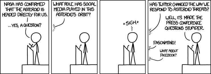
1239: Social Media

Now this is what I call a joke. Four panels, two punchlines. The comic timing is all there. A for humour comic timing. A+ for taking a much-needed dig at social media, because every time I hear the phrase 'social media' I want to strangle someone.

B+ for the realistic-ish dialogue. B- for the alt text, which wasn't great, but I couldn't quickly think of anything better. The artwork, while not great,

C- for the artwork. It was pretty much just the same panel four times. He did everything but copy and paste the man and the podium. That being said, I can't see the joke working in plain-text form. It needed that beat panel and the *sigh* to really emphasise the guy's disdain at the unbelievable yet plausible stupidity that there are people dumb enough to ask if social media affects asteroid orbits. So I don't think the C- matters. Does any of this matter?

Next!

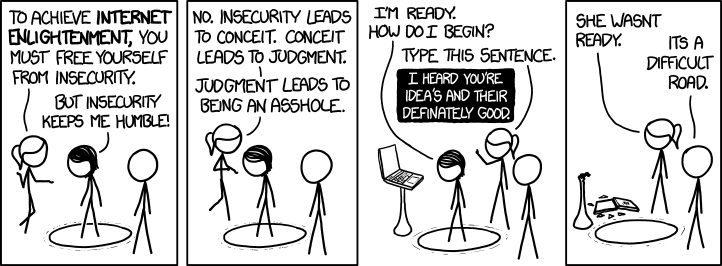
1238: Enlightenment

I like the ridiculousness of this whole scenario where the internet equivalent of enlightenment in whatever this is parodying (my guess is on Star Wars, but nerd law forbids me from remembering the prequel trilogy), and the, uh what's the word, quirkiness. Yes, I said and xkcd comic is quirky. B for quirkiness. So shoot me.

C for actually making sense - although I get how the 'I'm better than you' attitude is rooted in insecurity (of course I know that - I'm writing this blog!) I'm not sure how deliberateley typing a sentence with bad grammer is going 2 fix anything.

A for the cheesy dialogue in the final panel. You may call it post-punchline. But I say it adds character to the comic.

Next?

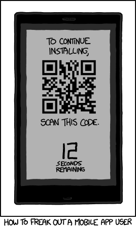
1237: QR Code

A for instant entertainment value. I just love the idea of ten thousand smartphone users suddenly panicking when the realise they have to scan a QR code on the front of the device and wondering whether their plight is the result of bad app design or just good old trolling.

And when you think about it for a second, you think 'how would that work?' Would the user try to take a picture of the phone? Engineer a system of mirrors? Hand-draw the QR code on squared paper, then realise the . The alt text answers one possible question, and allows you to pursue this avenue of thought a little further. So A- for that, as it does strain my willing suspension of disbelief.

B- when you realise that most app stores allow you to install apps with one or two taps of a button, and the entire 'installer' scenario was contrived just for this joke, but it's still a good joke.

And A for succinctness. It's been a while since he's told a joke this good in so few words. And yet it wouldn't work as just text. It makes good use of the visual nature of its medium.

Next...

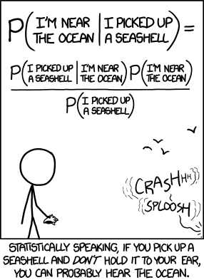
1236: Seashell

I had to think a little too long for this one. The point he's making is mathematically quite simple. I'd understand it in my own head. However the notation is confusing. I could probably explain it to myself with a venn diagram - in fact hey, why didn't he just do that?

Now, I mentioned the point he's making, rather than any joke. similar to the previous comic. However, rather than making a salient point like the nonexistence of aliens, it wastes its effort explaining why the hearing-the-sea-in-seashells thing is total bullshit. And we knew that already, so... thanks? What is even the problem with that in the first place? It's a cute thing to tell children. It doesn't need to be debunked.

D- for a not-so-good point. F for the notation used to explain it. D- for humour, because fuck it. Oh, and F for smugness. Have I missed anything?

Next

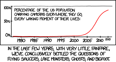
1235: Settled

Okay, the thing that bothers me about this one? It just sounds so smug. D- for smugness, or am I jumping the gun?

Explaining the joke? Perhaps. There isn't really a joke to be made, but the point he's making is a sound one. I think he'd be able to make the same point, and make it a little bit funny if he'd just put the lower caption at the top. A for a good point. C- for wordiness. But the wordiness doesn't kill the comic.

I'm not going to question the accuracy of the data. It looks about right. And besides, who needs data to know that the vast majority of people in the western world have some form of cameraphone? B+ for data accuracy.

Whoops, that's only six. But don't worry, you'll get another six tomorrow, provided of course that the sun does rise.

Saturday, July 27, 2013

1232-1234: Three Boring Comics

This week's comics were quite uninteresting. I'm sorry if it sounds like I don;t have much to say about them. Form your own opinions in the comments if you have to. And read the review when you're done.

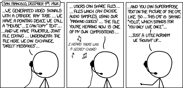
1234: Douglas Engelbart (1925-2013)

Am I missing something here? So the joke is that he's discussing decidedly modern things in an apparently famous tech demo that happened in 1968? There are better ways of doing an Anachronism Stew. I had to look up Douglas Engelbart. He is the guy who invented the computer mouse, among other things. I don't know about the demo, but I'm guessing it was especially ahead of its time, or somehow prophetic of how we use computers today. I feel like I'd be dancing on someone's grave if I bashed this comic too badly, so instead I'm going to damn it with faint praise.

C for humour. D+ for the references that felt shoehorned. D for wall of text. 

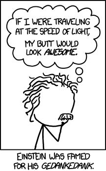
1233: Relativity

No, you're butt would not look awesome because:
  • There is no 'at the speed of light'. This is one of the first things they teach you in relativity. There is only 'near the speed of light'.
  • Your butt would look bigger, but only in proportion to the rest of your body.
  • There are obvious practical issues with flaunting your butt when you are speeding past your observer at nearly the speed of light, namely that you'd be too far away to see after a fraction of a second.
I am only nitpicking it this way, because you need to know relativity in order to understand the comic in the first place. And that makes it not work. It doesn't even make sense on its own terms. It's the sort of thing that is funny to middle school students who know a bit about relativity, but not enough yet to ruin the joke. That is the audience Mr Munroe is aiming at.

And he's putting words in the mouth of Einstein. Zombie Marie Curie was bad enough.

C for premise. D for the unclear punchline. F for possessing great scientists.

1232: Realistic Criteria

I feel like he's done this comic before. White hat guy is back to reprise his role as the unscientific strawman. It says nothing new. It's preachy. Can we please move on now? 


D is for deja vu. D for preachiness. D for lack of a punchline.

Friday, July 26, 2013

Comics 1229-1231: Spaced Out

So I have learned today that Blogger's automatic publishing feature sucks. Apologies again to those of you refreshing the page madly 24 hours after the last post.

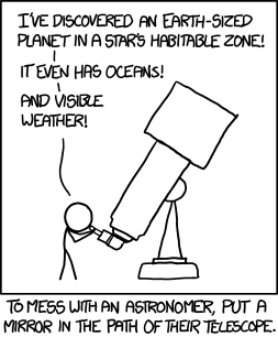
1231: Habitable Zone


This is one of those comics that makes you chuckle just a bit before you realise the many ways in which it doesn't make sense. Surely the astronomer would know the telescope was pointed back at earth? Surely this is not how they actually discover planets. Surely that would take months of peer-reviewed research?


B for humour and the immediate impact. D for the stupid premise that you notice 5 seconds after laughing at the thing.

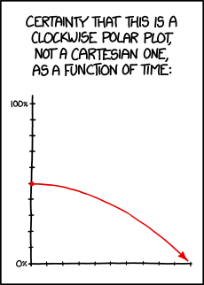
1230: Polar/Cartesian

If it's wrong that I thought of slash fiction when I saw the title, then maybe I don't want to be right.

Yeah, I don't know what to think of this one. At first you're uncertain whether the graph is cartesian or polar. But as time goes on, you slowly realise that it is cartesian. But the circle-ish curve gives it the appearance of a polar graph, hence the initial uncertainty. Now that I think about it, there really isn't much to it.

C- for humour - it took a little while to understand, and the pay-off isn't great. B for absurdism. Yes, self-referential graphs fall under the category of absurd in my opinion. And B+ for alt text, which is similarly absurd. A for effort, because I genuinely believe Randall thought about this one. F for failing to label the horizontal axis.

1229: Screensaver


So at first I thought this was a reference to some game. Just as I was writing this review, I noticed it was actually a reference to the Starfield screensaver from Windows. What can I say - it's been a while since I've seen it, and I'm an idiot who doesn't read comic titles. So I am probably the last person in the world to get the joke.

In all honesty it's brilliant. It's clever a twist on something we're familiar with that's original and well tolf. Now that I think about it, I'm sure I've noticed how some stars stay really close to the middle for a long-ish time. But it's not something you'd automatically come up with yourself after seeing that screensaver. That, to my my mind, makes it original.

I'm not even going to discuss the idiocy of staring at a screensaver for 20 years, because I believe that is part of the joke. Furthermore I know a screensaver would not actually do that unless it was deliberately programmed that way, but it's wish fulfilment - I'm sure we'd all like to see this happen.


A for originality. A+ for wish fulfilment (even if it's just a small one). C for topicality - yeah I'm gonna let the harsh marks slide because Windows 3.1 was already fifteen years old when he started xkcd. There is no way he could have possibly made this comic topical. A for execution - the comic timing is just right. B for artwork - I can't help but feel I'd understand it sooner if it was more obvious that  we were looking at a computer screen.

Thursday, July 25, 2013

Comics 1226-1228: I Go To Extremes

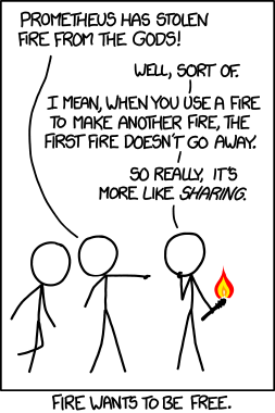
1228: Prometheus

'I'm here to return what Prometheus stole.' would be a good thing to say if you were a fighter pilot in a Michael Bay movie where for some reason the world's militaries had to team up to defeat every god from human mythology, and you'd just broken through the perimeter and gotten a missile lock on Mount Olympus.

The third xkcd of the week is pretty damn good, albeit not enough to redeem the other two. It makes a point, makes it concisely, with just the right amount of subtlety. Now obviously I'm biased because it's a point that I agree with. But it caters nicely to the xkcd crowd. The artwork carries the point perfectly. There is plenty of good stick figure body language. The little splash of colour is a nice touch. And the caption below works well as a second punchline, without explaining the joke. This is a rare good xkcd. You heard it here first - well - last.

A for the concept. A+ for execution. A- for the alt text, because it was only tangentially related to the comic, and I feel it was good enough to make into its own comic.

1227: The Pace of Modern Life

Oh shit, I forgot how bad this one is. It would actually make a point if the quotes were gathered from a wide range of history, rather than just an arbitrary 44 years. And it really should make its point alott more concisely than that, and the quotes should be linked together. Instead it manages to be preachy without even saying anything.

Furthermore, the bits he's emphasised in black are not the specifics, or the generalisations. They seem to be highlighted pretty arbitrarily.


F for artwork, since there isn't any. F- for humour*. F-- for actually going somewhere And F--- for wasting our time. And yes, the guy who's already spent an hour writing this tat, is complaining about timewasting.

I also think it scores Over 9000 on the Ravenzomg Scale Of Wordiness, though I'd have to check with the hell-bird herself for that one.


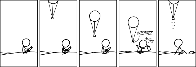
1226: Balloon Internet

Am I missing something here, or is the balloon just annoying the guy by giving him internet? Is that the entire joke?? Really??? There is so much wrong with this comic - let's make a list
  • I can't tell if the balloon is supposed to be really small or really far away.
  • And if it's giving him free internet, he should be fucking grateful.
  • If it's giving him internet that looks free but isn't, then he has a right to be annoyed, but the comic fails to make this clear.
  • The guy isn't even on the Internet. He's reading a fucking book.
  • Why would he drop the book if there was internet nearby? I don't think he can sense radio waves with his nose.
  • Unless the balloon is audibly shouting the word internet. But that's too dumb for words. That can't really be what this comic is about.
  • Oh God, it is.
  • The balloon really is tiny, and it is literally creeping up behind him to shout 'INTERNET' in his ear.
  • This would serve no purpose for the team controlling the balloons. It's not even funny in a classhole-ish way.
  • Is internet supposed to be an onomatopoeia? I don't fucking know anymore!
  • The first three panels are copy-pasted.
  • The alt text has almost no relation to the actual comic, and is 100 times better than said comic.
  • He's sitting on a giant arse. And now you can't un-see it.
The saddening potential is what this comic could have been. No I don't mean he could have conveyed the point by drawing it better. Scrap all five panels. We're starting again.

In case you don't know, the context of the comic is an actual project by Google to develop balloons that bring internet access to rural areas, so it was a rare opportunity to be topical. And the idea of getting internet coverage from a balloon is pretty damn cool. Already I'm thinking of airships, steampunk goggles, and sysadmins fighting it out in the sky with crossbows, and Google's hidden sky fortress.

Randall has explored these themes before with his depiction of Cory Doctorow, which would have been a perfect match for this context. Internet balloons are the stuff of classic xkcd. He had every reason to bring that character back, and he wasted the opportunity. At very least he could have made a cloud computing pun. But instead we get a little balloon that shouts internet for no reason.

I have nothing more to say to this, except: G


I think I'm going to call it a night.

*Don't you fucking dare correct me, yanks.

Wednesday, July 24, 2013

1223-1235: Holy fuck, that's alott of comics

Sup haters. Sorry for the lack of reviews. I forgot about it one week, and then I couldn't face my mistake. To make it up to you, I will post three comic reviews per day until I am caught up with xkcd. We British are good at apologising, so sorry sorry sorry sorry sorry.

I'm trying out a new grading system where I give different grades to different parts of the comic. Let me know if it works.

As always, hover over the comic to see you alt text. If you're on a mobile device, then get a real computer for fucks sakes.

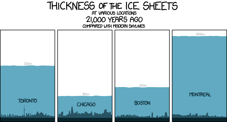
1225: Ice Sheets

Yes, we get it. Ice sheets are thick. Is there supposed to be an environmental message here? A+ to whatever textbook he stole this from. F for humour. F- for the essay-length alt text

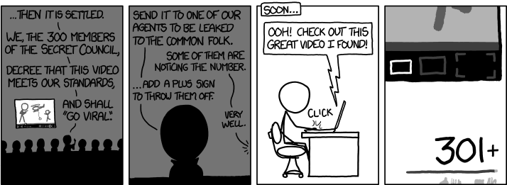
1224: Council of 300

I like that this comic appears to belie Randall's self-important belief that he is the first person to view a video that will become popular in the future. At least that's the only way the premise makes sense. Alt text belies that he clearly didn't know where he was going with this one, since it's far too long and rambley, bit like this review - B for its unintentional meaning. F for wasting the observational humour goldmine that is 301+ Youtube views. No really, I mean that.

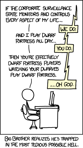
1223: Dwarf Fortress

I am not sure what is the context where this conversation can happen. Can someone please explain the Dwarf Fortress reference? I think I get the point he's making - luckily there is a caption to hamfistedly explain the joke. C for concept. F for execution