

 Posts
Posts


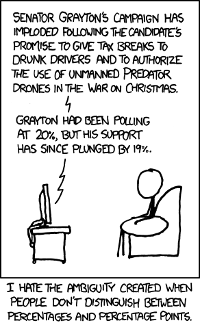
title: Percentage Points;alt text: Grayton also proposed making college scholarships available exclusively to sexually active teens, amnesty for illegal immigrants who create room for themselves by killing a citizen, and a graduated income tax based on penis size. He has been endorsed by Tracy Morgan, John Wilkes Booth's ghost, and the Time Cube guy.
You know what I occasionally enjoy doing? Pretending I'm Robin (the Burt Ward one) from the old campy Batman series. And by saying that, I mean I enjoy imitating his overused "Holy [something fancy], Batman!" catchphrase. That said, don't look at me strangely when I say this:
Holy four lines of alt-text, Batman!
I did something weird a few days ago: I reread the early archives of Xkcd. Okay, so there's not too much to say about it. It was way back before Randall had a huge fanbase to pander to and otherwise appear nerdy at. I've alluded to reading a lot of webcomics before, so what I saw was nothing unexpected for a fledgling artist--a little less consistent art, less of a feel for what the comic is about, that kind of thing. But you know what struck me most? Brevity. The first comic's alt-text is three words long. Tiny. It added a little something meaningful to the comic, but didn't distract the reader from what they had just read.Compare that to today's. Ew. 985 shows up as a whopping 4-line, 50 word, 317 character (268 excluding spaces) monster.
The joke isn't one I find funny, but humor's subjective so I'll let that one slide (in this case). Even if I found this joke humorous, I still wouldn't laugh. Why? Because I had no clue where the comic was going. My eyes followed, in order, the title, text in panel, the caption under it, and finally the monstrous tooltip.
Here's a brief view of what's going on in my head at that point:
Title: "Percentage points" Okay, so it's all about--
Panel: um--drunk drivers? Drone strikes on Christmas? I what is going on--
Caption: Wait polls now?
Tooltip: What is going on??!?!?!
Afterwards: Okay, I need to reread this. Dammit.
The Alt-text is busy. So is the panel. In fact, it's so busy that I forgot about the title (which foreshadowed the allegedly funny caption) on the way down. It's not that I have ADD or something--I just couldn't see how it was funny through the thicket of other jokes. When the focus of the comic--"Percentage points" as the now-forgotten title had told me about--hit, I was just confused because it seemed like the joke hadn't been set up everywhere.
One thing I sincerely hope Randall will learn is that you can't always fit more than one joke into a comic. Of course it's possible: see this Brawl in the Family (and commentary!) for an example of a secondary joke in the background that doesn't detract from the what the author's been building up the whole strip. But in this Xkcd? The extras distract from the joke that the title indicates he wants to make fun of or complain about or something. As a result, the actual joke feels underdeveloped or, in my case, not there at all.
Here's a "Sucks (not that much) Less" from me:

title: Percentage Points;alt text: Don't we all.
Okay, Still not funny. But it's clear on what joke it's trying to get through. That's at least a step in the right direction.
tl;dr: the alleged joke is buried inside a mountain of other jokes. The two parts are bad for each other.
Addendum: The sharper-eyed members of the audience will notice that I reused the til-now solitary "list comic" tag. Well, to be fair, the list isn't exclusively on the comic. It extends through the tooltip as well.
And another thing: The tooltip! I just realized I started talking about the tooltip and didn't really go back to it. Uhm, that's totally intentional. See what happens when you start with one thing, distract the audience with something else, then go back where you started? They're confused as hell! This was totally a self-demonstrating article! Right, guys?
....
Guys?


