Announcement

Died in a Blogging Accident has lived up to its name and died... in a blogging accident. That is to say it has concluded. You can still re-live the magic by clicking here to start at chapter 1. For genuine criticism of XKCD, please click the top link to the right (XKCD Isn't Funny).

Monday, September 16, 2013

Reviewing The Classics: 77, 72, 12: Black Hat Guy Begins

No one can agree when Classic Xkcd finished, and when the new comics started sucking. The original xkcdsucks blog started at comic 409, a comic most, if not all newer readers, would assume belonged to the 'Classic Era'. But everyone always seems to agree on one thing: 'Xkcd was at its best before I started reading it.' That of course varies depending on when you started reading it. When you're browsing through the archives you can press the 'Random' button as many times as you want and skip past the bad comics. But once you slow down to three new comics a week, they start getting 'worse'? Mishegas I say! Xkcd has always sucked. And here I am going to prove it for you by giving you my honest opinion of three such 'classics'. Kill me before I use inverted commas any more.

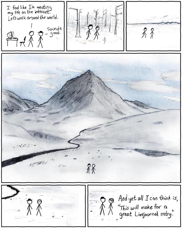
Comic 77: Bored with the Internet


'But that was one of the best Xkcds!' I hear you say. Stop kvetching. I'm the one writing the review. The fact is, this would not pass as 'good' if it was released on xkcd.com today. At most, it would get a 2-page thread on the fora and a footnote on xkcdsucks.

Oh, and don't be thrown off by the appearance of Black Hat. He doesn't do anything Black-Hat-ish in this comic.

First, let's get the obvious things out of the way. C+ for artwork. Yes, The landscape is impressive, but only if you haven't read any other webcomics. It's just that every other panel doesn't measure up to it. Panel 3 gets a particularly crudely drawn crinkly line to represent a mountain range. F- for visual consistency. Furthermore, he can't seem to draw stick figures when they're walking. That is why they appear to be standing still in most panels, but Black hat is tripping over his own foot in panel 2, and doing some kind of athletic stretch in panel 3.

Now, are the two lines of dialog in panel 1 realistic? No, but at least it has few unnecessary words. And at least you can tell who's saying what. The final panel just has a line suspended in mid air, appearing to come from no one. D for clarity.

And I'm not sure if people thought this was fresh and original back in 2006, but I certainly don't. The joke is that someone tries to live without the internet, but can't. He actually did this joke again in 597, which was significantly funnier than this one. F- for humour. Don't worry Randall, at least you're not getting worse.

And the alt text? 'I used to do this all the time.' Really? I doubt it. F for lying.

Comic 72: Classhole
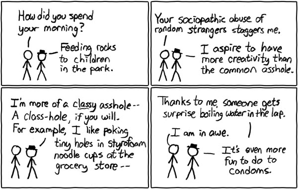

Uggh, a comic about two stick figures standing and talking in what may well be a white-coloured void. F-- for artwork, and I don't need to explain why. Oh, you want me to? Fine. It's that old rule of 'show, don't tell'. Randall never actually actually drew Black Hat's exploits. Rather he has Black Hat say what he's done. This, my friends, is bad writing. Couldn't Randall draw a rock, or a styrofoam cup? Of course he couldn't, and he still can't.

The dialog is stilted beyond belief. The like 'How did you spend your morning?' is a really poor exposition device. Its only purpose is to prompt Black Hat to deliver a fountain of exposition. And 'I am in awe.' is something no one would ever say. F-- for bad dialog, and F for wall of text.

And It bothers me that one of Black Hat's plans has the result of causing dumb people to have more babies. F- for bad family planning.

Most people think this is the first appearance of Black hat. But they are wrong. That honour goes to...

Comic 12: Poisson


WHAT?

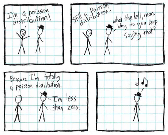
A stick figure can not be a poisson distribution. Why should I even have to say that? And Black Hat made the poisson distribution guy... die? Disappear? Did he just frighten him away or what? And what's wrong with negative numbers. We don't know until the alt text EXPLAINS THE JOKE.

F+ for artwork. It's two stick figures meeting in a white-walled void. But it's worse because it's drawn on SQUARED PAPER. Even when he was doodling in class, he couldn't man up and get some plain A4. Even so, there are Photoshop filters that can remove blue lines from an image, have been for years. What is wrong with him?

He only gets the '+' because one of the stick figures actually appears to have a face. But that face is gone by the 3rd panel, and Black Hat never even had a face. So again, F- for visual consistency.

It almost goes without saying, but F- for Black Hat character consistency. He was flawed from the start.

There is no reason why he had to reference an obscure statistical concept for this. D for standalone value. I myself have studied poisson distributions at A-level, and there's nothing inherently funny about applying them to a negative value. It has real-world applications, so it would be like saying 'I have flipped a coin -1 times'. 

He could have made the same joke about a more well known mathematical function, like a square root, which also does not work on negative numbers, and it would have lost none of its original meaning. G- for humour. G-- for explaining the joke. Erase those awful doodles from your notebook right now!

Saturday, September 14, 2013

Comics 1262-1264: The Future of Xkcd

I hope you have noticed by now that I am incorrectly capitalising Xkcd on purpose. Randall prefers it to either be all lowercase, or all caps. Anything else is an insult, and I would encourage you to do the same.

Hover over the images to see the alt text. And if you are browsing on a mobile device, you can view the alt text by downloading the Xkcd-sucks app, available on the App Store and Google Play... never!

Comic 1264: Slideshow


Of all the annoying things he could have picked that annoyed him about today's HTML5-dominated, social-media-oriented, search-engine-optimised, internet-that-has-become-a-parody-of-itself. He picked slideshows.

Web design has committed far greater sins, including share buttons that follow you as you scroll down a page, contextual ads disguised as hyperlinks, fake download buttons, pages that get longer as you scroll so you can never reach the bottom, and (perhaps worst of all) blogs that don't have an RSS feed. But slideshows, really?

I've only really seen them on the front pages of estate agents and companies that want to show off their product portfolio - i.e. not the sort of website you come to to enjoy yourself (unless you're an Apple Inc fan, in which case you can fuck off). So it's not a problem for your daily internet usage, not even a first world problem.

I had a look around Flickr, and I couldn't find any examples of this happening. So the alt text is lying.

F for relevance, or lack thereof. F- for crappy alt text. F-- for humour, because there is no joke. Oh, and before I forget, F----- for smugness, and using Xkcd as his personal soapbox.

Comic 1263: Reassuring


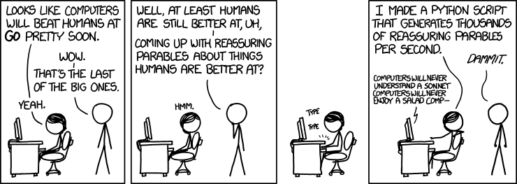
This is a comic that is trying to be depressing by telling us that computers will become more powerful than our own brains. He did this before in 894 (Progeny) with a better joke, and fewer words. That older comic made a better joke, and in fewer words.

I get the impression some fans are using Xkcd as a news site. When something happens to Curiosity or Voyager I or whatever, many people, including self-confessed nerds, would not hear about it unless there had been a topical Xkcd on the subject. Following that logic, this comic's function is alert people that computers had beaten Go. So I checked if that was the case. As a matter of fact, it was topical... in 2009.

Here is an article on the subject, which was posted four years ago. As a matter of fact, it makes an interesting point.

“It’s a silly human conceit that such a domain would exist, that there’s something only we can figure out with our wetware brains,”

You see Randall? It really doesn't matter that computers will become more intelligent than us. So stop clinging to your false ideas of 'Humans are better than computers, because... some reason.' Of course they're not better. It's only a matter of time until a computer comes along that writes better Xkcds than Randall.

F-- for topicality. D for humour. D- for wall of text. B for the alt text, which was funny and original. It was better than the actual comic, and should have been the actual comic. Randall needs an editor to see the potential in ideas like these. D for the artwork, because I am so bloody bored of stick figures sitting at computers and talking.

Comic 1262: Unquote


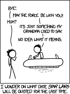
I tried to come up with something to say about this comic. It's not offensively bad. The Star Wars reference doesn't kill it. But it doesn't say anything remotely original. Yes, people will eventually forget about Star Wars and stop quoting it. So what?

My apathy towards this comic is such that I'm going to give it a rare E for humour, artwork, alt text, everything. After all, it's not as if anyone could be emotionally affected by this comic in any way.

"I got tears in my eyes, thinking about that."

Sunday, September 8, 2013

Comics 1259-1261: Lethal Dose Of Xkcd

I am writing this from the middle of a fucking desert where there is NO INTERNET. I had to borrow the wi-fi password from the hotel across the road. And Blogger’s interface has been translated to Turkish*. I clicked on whatever the translation for ‘new post’ is five fucking minutes ago, and the page still hasn’t loaded. FUCK YOU TOO, SHIT DESERT WI-FI.


I am in a really bad mood, so I should be perfect for reviewing some xkcds, IF THE PAGE ACTUALLY LOADS. Oy vey.

Comic 1261: Shake That


As much as I wanted to start with a strongly negative review, I'm afraid to say that I actually liked this one.

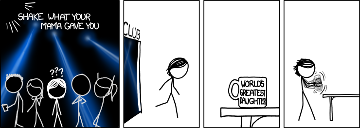
I hate nightclubs. I too hate it when the lyrics to popular music are thinly veiled pornography written, by an egomaniac, and sold by corporate scholbs. Get out of my head, Randall. So I like the way he is mocking the trend, by interpreting the lyric literally, thereby robbing it of all its erotic surtext, and reducing it to absurdity. A+ for creating a joke that appeals to my cynical self.

I also quite like the artwork in the first panel. Okay, so the first panel is showing off. But still you can quite easily see that she's in a nightclub, and what is happening in each panel. No space is wasted. So the artwork is good enough to convey the joke well. B+ for artwork.

And just because I'm feeling mean. I'll give it a G-- for standalone value, because I'm assuming 'Shake what your mama gave you' is a reference to a lyric that I haven't heard. And if I haven't heard it, then it is NOT OKAY for Randall to make an xkcd about it. You're welcome to disagree.

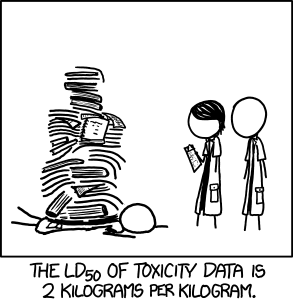
Comic 1260: LD50


This... I don't know what to say to this. D- for standalone value. By my guess, half of the xkcd readership does not know what LD50 means. LD50 is not an obvious acronym. It means the minimum lethal dose required to have a 50% fatality rate.Those people will not understand the joke, unless they look it up on Wikipedia. That's not good enough.

The joke itself is... kinda cheap. It's the sort of joke you'd crack a laugh at if you saw it in a scientific article. But that's because you're not expecting a joke. Humour is derived from the subversion of expectations. But people visiting xkcd.com are supposed to expect humour (so I am told). So this gets a mere D+ for humour.

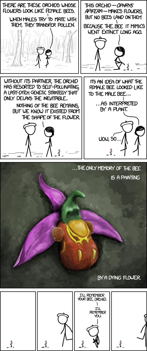
Comic 1259: Bee Orchid


Ah, the golden child of last week's xkcd comics. The perfect analogy for this comic is James Cameron's Avatar - it really enthralls you for the duration it takes to watch/read it. You think it's really profound, and you're willing to forgive the clunky exposition because it looks so pretty. But a few days later, you start to think about it too much and you see all its faults. It's kinda depressing. The environmental message falls flat when you realise it is scientifically inaccurate at best.

Surely it would have already gone extinct by now? Surely if Jake Sully had told the natives that they were in danger, then he could have avoided the destruction of Hometree? Surely Beret's memory is worth nothing if he doesn't also take a photo for others to see? Do the Na'vi even deserve to live if they put their faith in a leader like Randall Munroe... wait?

As limp-dick science major Anonymous 7:17 rightfully pointed out, the bee orchid does have living pollinators. So you know what that means? Z for accuracy. That's right. I used the last letter of the alphabet. Weep in shame, Randall. You couldn't even earn your legs back. 

Now for the artwork. I'm not going to pretend the artwork is not good, because it is. But xkcd produces good artwork so rarely, it's always an unprecedented surprise. This is not a good thing. The point being, there are 10 panels in this comic that don't have artwork of this quality. I know it would be impossible for Randall to produce every panel to this quality. But Tom Siddell manages to do it.

Every panel of Gunnerkrigg Court is of this quality in terms of artwork. It got noticeably better when Siddell went professional with GC (about a year ago) but it was pretty good before then. And it has the same M-W-F schedule as xkcd. So don't praise xkcd for good artwork without seeing the big picture. This comic gets a B+ for artwork, but only a B+.

Pacing of the comic leaves a lot to be desired wall of text occupying the first four panels. Let's just give it a D for pacing and be done with it.

Also, someone on the forum suggested that 'painting by a dying flower' means that Randall's wife did the 5th panel. If that is true, then it gets an A+ for subtlety, but an F- for playing the cancer sympathy card. 


*Fuck you too, Google. Just because I am browsing the Internet in Turkey, does not mean I speak fluent Turkish.

Monday, September 2, 2013

Comics 1256-1258: September Solitudes

Well, summer is ending, and I feel so alone oh God. This blog is all I have for company. Please make me feel less alone by writing a comment.

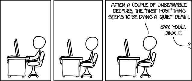
1258: First


This is awful, Randall. *Takes off belt*

F for observational humour - you are literally just commenting on an established trend, and not even telling a joke about it. G for accuracy - the 'first post' phenomenon is far from dead. H for quantum egotism - it's like you decided that if you don't observe it happening on the forums you frequent, then it doesn't exist. I for actually acknowledging the phenomenon, and encouraging more trolls to do it. And don't you fucking dare say that jinxing it on purpose was the point of the joke, because there was no joke. J for lack of a joke. And it looks like you were still trying to do a dramatic buildup for this nonexistent joke. But instead of a joke we get smugness. K for smugness - wipe that grin off your face, because even if there had been a joke then it would still be L for comic timing. The beat panels literally add nothing. M for artwork - the guy barely moves in three panels, and the other character (presumably a woman) is off-panel. And if I wanted to see a stick figure sitting at a computer, I'd look in the fucking mirror. N for appealing to your core demographic - even the forum thread couldn't find anything good to say about it. It just degraded into a 'last post' forum game, then burned out after two pages. You've created something that even the fora can't nerd out on. Think about that. O for being so bad that even Gizmodo wouldn't touch it. P for wasting precious pixels on my screen. Q for the 23 kilobytes I wasted to download this. R for the 35 minutes I have already spent writing about this. I am so fucking angry at this comic. How fitting it is that the harshest grade so far is the first letter of your name. But I'm going to stop there, because there are some things that can't be said with alphabetical grades.

48 BELT LASHINGS for the worst comic I have ever reviewed, one for each of the comics I have reviewed before this one. *Deep menacing breaths, whimpering, and obscure Yiddish expletives are heard from the corner. Thwack, thwack, thwack, thwack...* AYIN KAFIN FAKATA YAN RANDALL. Say first post again. I fucking dare you.

C- for the alt text, which was actually quite good.

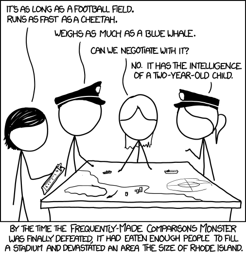
1257: Monster


After the 'First' comic, anything looks good in comparison. In hindsight, I probably should have left that one till last.

D+ for dialog. It's terribly stilted, but at least it conveys the joke. B+ for artwork. While it violates show-don't-tell by not actually showing us the monster, I don't actually think that is important. The war room is surprisingly detailed for an xkcd, and showing the monster would ruin the joke. Oh and C+ for the joke. It was not bad, I guess. And B+ for the timing of it. The caption completes the joke, and doesn't whack the reader in the face with an unnecessary explanation. He could have added a few more comparisons in the first two lines of speech to make it more ridiculous, but that's my only real complaint.

1256: Questions


I wanted to hate this one, but when I read it up close, I almost laughed in spite of myself. Funny lines questions like "Why do snakes exist?" make up for at least five not-so-funny ones. This is Randall playing to his strong point, and it works. So I'm actually going to give it a for humour.

It's funny because the questions are dumb, really dumb. And he's not mocking them in a smug way. B for lack of smugness. They remind me of the sort of questions that a child would ask. With the advent of the Internet, we have become like silly little kids, treating Google as our collective daddy-who-knows-everything. I would have liked to see the comic make a joke about this, or explore it in more detail. D because of what this comic could have been

A for effort. No really, it can't be easy to look at several hundred Google search suggestions, and pick only the stupid ones.


By the way, if you get the reference in this post's title, you don't get a million nerd points or anything. You just get get my unending unconditional love.

Tuesday, August 27, 2013

Comics 1253-1255: Forever Delayed

Sorry for the long wait. We had a bank holiday here in the UK. Did I mention that I am British? Good.

Next time I delay fail to post a review on time, feel free to complain about it in the comment thread. I like it when I get comments.

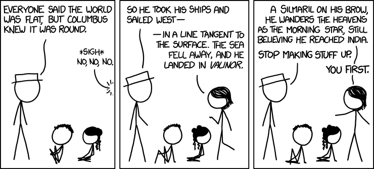
1255: Columbus


B- for humour and delivery. The dialog flows quite well, which carries the joke., and the "You first." in the final panel actually makes quite a good (if a little predictable) punchline. I didn't laugh out loud, but I got a rare smile from it.

D for smugness. I should have seen it coming, as the strawman is played by White Hat. But it grates a little that despite the funny joke Randall's original inspiration for the comic was probably about how he should rightfully inform the masses that Christopher Columbus was a fraud, and didn't really direct two Harry Potter movies, or something.

As always, the man is the butt of the joke, and the woman gets the better of him. F for the continued portrayal of women as righteous she-geek goddesses who say and do no wrong. Okay, I'm exaggerating a little, but you get the point.

Something is wrong with the second panel. White Hat should have a speech line, but he doesn't. So it was a little hard to tell who is talking. F-- for quality control. This kind of error is inexcusable, especially when it goes uncorrected for five days. Randall should fucking proofread his comics. It doesn't take long. I write my reviews late at night, so I probably make the occational misktae. But Randall should not be doing the same with his comics. He is the one getting paid.

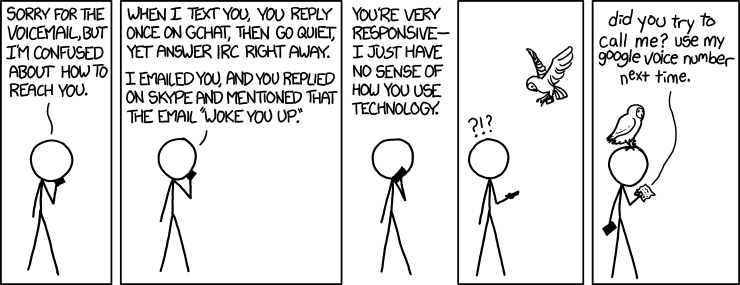
1254: Preferred Chat System


This is making the exact same point as a previous comic. I forget which one exactly, probably the standards one, of one of the Google+ comics. But either way, it says nothing new. F for originality. 

The punchline almost managed to redeem it, so C+ for punchline. The Harry Potter reference is kinda cute. But even if you didn't know they used owl post in Harry Potter (and to be fair, there are some who don't), it still works as a punchline. So I'd give it B for standalone value.

I have it on good authority that owls can not teleport, even in the Harry Potter universe, so why is it able to respond almost instantaneously? F- for realism. He could have just added a simple beat panel, and it would have improved the pacing.

DETENTION for Gizmodo repost. Guess it's inevitable when the comic is about tech.

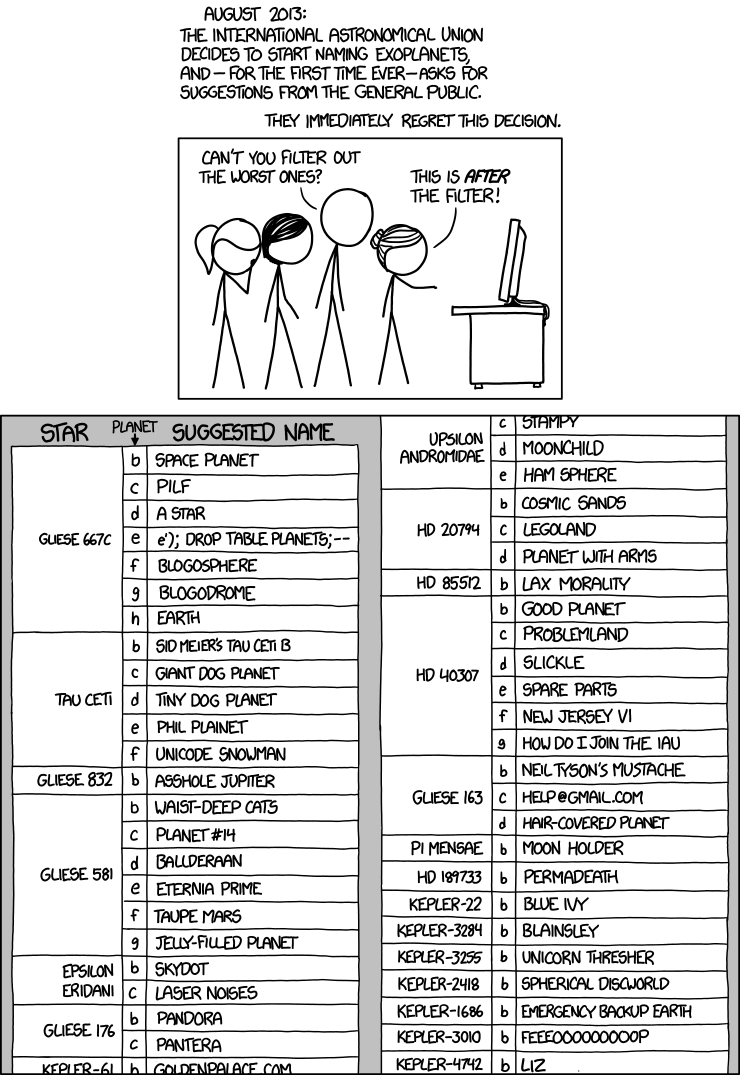
1253: Exoplanet Names


Another list based comic. Wow, we haven't had one of those since... last week. Okay, what are its strong points? Well, it's strangely devoid of pop-culture references. It would be so easy to name half of them after planets from Firefly, which would alienate the inferior section of nerds who don't even know the full list of locations from Joss Whedon's opus. He could have so easily done that, and he didn't. That's a solid A for standalone value.

The actual list of planets is fairly bland. I wanted to like this list, believe me. But it somehow feels dull and uninspired. So, C- for humour. It's not terrible. It's just that I feel I could have come up with something better. In fact I'll prove it. Here is my list of names. Tell me if they are funnier than Randall's 
  • THE BEST DAMN PLANET
  • test
  • Hell
  • untitled.jpg
  • Urpenis
  • How do I name planet?
  • Help Im trapped in a planet factory
  • Your Mom (F- for missing an obivious your mom joke)
  • Chocolate planet
  • lol
  • Not a planet
  • FUck
  • aertmatdnabkjwrKJBNSUDGNSOANUIRIUWBNKLjANBKJLNkj
  • FuckFuckFuckFuckFuckFuckFuckFuckFuckFuckFuckFuckFuck
  • Cunt-Cunty-Dick-Fuck
  • Giant Testicle
  • iPlanet
  • tinyurl.com/ppgmsaa
  • Planet of the Jews
A* for 'Asshole Jupiter', because That was the best part of the comic.

But, someone had to say it. F for realism. Why is that? People are egotistical, and they would name planets after themselves. If Liz got through the spam filter, then what happened to the other names?

And I almost burst our laughing when I wrote Cunt-Cunty-Dick-Fuck. Seriously, why no swearing? It would have been funny as fuck to see xkcd break out in a bout of glorious gratuitous profanity. If ever there was a time to do it, it would be this comic. Randall thinks he is above this, but he's not (hello, 631).

F--- because the list did not include Planet Of The Jews, which feels like a major oversight.

DETENTION for io9 repost, and a letter to io9's mother. io9 should really know better than to hang around with bad influences like xkcd.

Friday, August 16, 2013

Comics 1250-1252: Brought to you by Gizmodo

Before I start the regularly scheduled reviews, I just want to rant for a second about something that annoys me. First, let me say that I never really sympathised with the idea that No One Is Forcing You To Read It (ah, for the days when Rob would bang out 356 words, but I digress). I read xkcd three times a week because I like to watch the slow-motion train wreck, not because my friends are incessantly recommending it to me (I don't have any friends, so I can't personally verify this fact).

But I can't fucking stand it when Gizmodo dot com reposts an xkcd comic with a few hastily written lines of text below it basically explaining the joke, and links back to xkcd, in lieu of an 'article'.


I'd link to an occurrence of this happening, but Gizmodo makes money from every ad view. Reading Gizmodo is my dirty habit, and I don't want anyone else to get addicted.

Why is this bad? I already checked the xkcd feed in my Google Reader Feedly today. I don't need to see it twice. Why waste all the pixels and kilobytes by downloading the same image twice?

Moreover, it's the epitome of lazy journalism - taking someone else's content and adding nothing to it. And yes, the articles they write (quoted in full below) really do add nothing. The headline of the article usually telegraphs the punchline, so if anything they are taking away from it.

And worst of all, it causes more people to read xkcd. They're acting as if xkcd is That Obscure Indie Webcomic that more people need to know about. Linking to a webcomic is a dangerous power - use it responsibly, like io9 does.

No wonder the Gizmodo editors love xkcd - with its faux minimalism, repeated pandering on a familiar theme, and its ability to make people feel smugly superior - it's just like a typical Apple product.

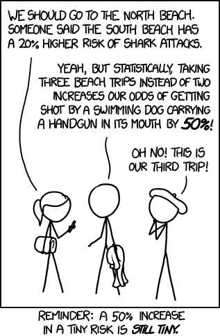
1252: Increased Risk


Surprisingly, the last xkcd comic of the week was actually quite good. The second paragraph would have been a fine punchline all by itself. But then Beret doubles the amount of stupid in the room, and gives us an even better punchline. A well deserved A for humour.

But surely this is just like a typical smug xkcd comic? And I hate smugness, so what's changed? Well, this one doesn't come across as smugly mocking a bunch of idiots, because the idiots are being real smart-asses about it, and therefore deserve to be mocked. There's a chance the one in the middle is being sarcastic, and the other two are taking it seriously, which if anything makes it better. A* for multiple interpretations.

The caption below ruins it a bit, but only a bit. D for explaining the joke in a smug way. But I kind of like the way it sounds. It sounds like the sort of thing I'd say. So B+ for self-affirmation.

And the alt text doesn't get a grade, because I care a non-zero-but-still-pretty-small amount about it. It would be so much easier if I was allowed to say 'could care less', but anyway...

1251: Anti-Glass


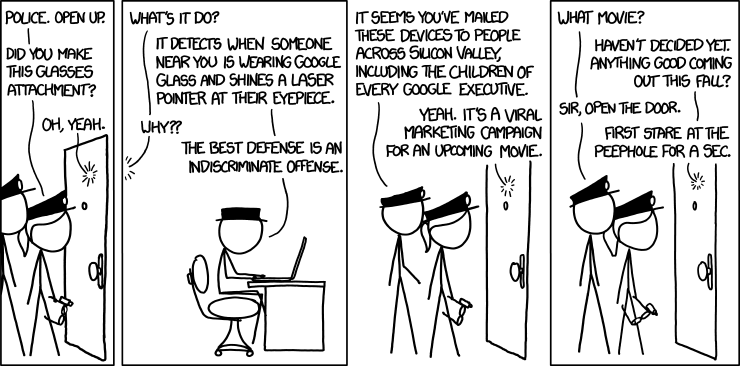
Before I say anything, let's see what Gizmodo's own Jamie Condliffe had to say about it.

"For all its promise of being the Next Big Thing in tech, when it comes to Google Glass, haters gotta hate. Still, if you're gonna object to it, you may as well do it properly.

Of course, this might not be strictly ethical. Or even legal for that matter. But, hey, someone is looking at you with a camera strapped to their face. They had it coming."

Fascinating. /s Think about that for a second. Does Mr Condliffe really believe this is the proper way to object to Google Glass, or is he just looking for something, anything, to say? My money is on the latter.

And the second paragraph... that's basically the punchline. Thanks for explaining it. /s

D- for art. The cops hardly move in the three panels they are in. Their hats look too similar to Black Hat's hat. Randall could have easily avoided this ambiguity. One need only reach into the RGB colour space, and colour them blue. Don't be a pussy, Randall.

C- for Black Hat's scheme. It seems to be in his usual style. But I have to question the effort and resources it would have taken to make something that will cause a handful of Google employees momentary annoyance at most.

The dialog in this comic is so fucking bad, I can't even begin to explain how bad it is. But maybe a letter will do. F for stilted dialog. But that's not all - DETENTION for Gizmodo repost.

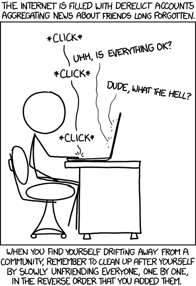
1250: Old Accounts


I don't see the point of this comic. I really don't. Do our accounts get lonely without us? (that would be dumb) Is removing friends somehow a necessity because otherwise those friends will expect us to still be contactable through an old account? (that would be dumber) Is it suggesting that we abandon those accounts before we stop using them? (stop, stop, my brain can't take the stupid!)

F for poor premise. And D for not communicating it very well to the audience. It took me a few read-throughs to 'get it', although I almost wish I hadn't. And all this despite that it would us no good to clear out old accounts that we might still want to use, Randall manages to be smug and preachy about it.

F- for smugness. F-- for preachiness. DETENTION for Gizmodo repost.

Here are Mr Condliffe's fine words about this comic:

"Next time you leave an online community, spare a thought for your account, which will sit there accumulating messages, news and all other kinds of crap which you'll never, ever see again.

Maybe you should do something about it. After all, it's like forgetting to get mail sent to your new address: there's a constant stream of information and news, slowly building up at your old place, that you'll never be party to ever again. And while it may mean nothing to you, it could be breaking somebody else's heart. You're better than that, right?"

That's exactly what the comic said, except in more words. The mailbox analogy doesn't even work, because closing a Blogger account would not somehow redirect its news and updates to Wordpress, hence why we are still here.

Friday, August 9, 2013

Comics 1246-1249: The Scattergun Approach

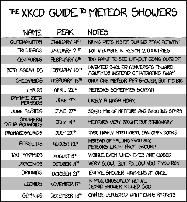
1249: Meteor Showers


"Surely 16 bad jokes are better than one, right, right?!?" Randall says. To be fair, some of them are quite good. They're just diluted in with the bad ones. I chuckled at "Not viewable in region 2 countries" - this is just the kind of absurdist humour that xkcd thrives on. B- for absurdism, but I don't think it was played up as much as it could have been. In short, he ran out of ideas. Two of the jokes actually seem to be the same (February 10th and August 12th).

The scattergun approach to humour sometimes works well, when the jokes are actually told well with, you know, pictures, like in Circuit Diagram, one of my favourites, but this one is too wordy, and I think the Comma Police are going to come get me for this sentence, So I'm just going to say: D for wordiness, which brings me on to...

F for artwork, because this violates Show Don't Tell in so many ways, has no real artwork, and could have just as easily been made in Excel.

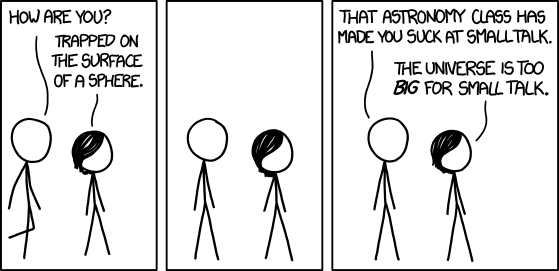
1248: Sphere


Ugh. F- for artwork. I know I gave the last one F, but that one was not designed to be artwork, which is bad enough. But this is an honest-to-gosh attempt at a depiction of two human beings, and it still sucks. No expressions. No movement. No soul. These stick figures are going to hell.

I'm also going to bring out the old F- for characterisation.

And that's without even getting into what they're saying. Stick-Megan's smugness is just radiating off the page. F- for smugness.

That said, it would actually be excusable if there had been some half-decent artwork to make us empathise with the character. Maybe replace the beat panel with a series of zooming out views of the planet. Show Don't Tell! Is it really that hard?

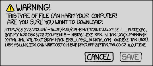
1247: The Mother of All Suspicious Files


This looks like a joke between friends that got out of hand. Randall and a group of his friends were sitting around a table at a LAN party or something, and joking about a computer virus. One of them suggested what the virus might be names. "That's not suspicious at all." someone else sarcastically remarked. The rest of his friends pitch in suggestions for names for this suspiciously named file like its some digital Royal Baby or something, whilst Randall is frantically taking down notes under the heading 'COMEDY GOLD'.

C- for the premise. It's not bad. Just not good either.

D- for the failed attempt at the scattergun approach. Like me, you probably read the whole thing, thinking that there would be a series of little jokes. Alas, those things that seemed so funny amongst Randall's friends at the LAN party are now not so interesting.

F for artwork. I don't think I need to explain why.

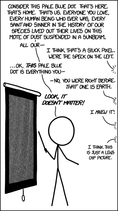
1246: Pale Blue Dot


So this is a joke about NASA's famous Pale Blue Dot. Most xkcd readers probably know about this already, but I'm sure some of them don't. So I'm giving this a C for standalone value.

The actual joke is pretty good. It gets a B for humour. I think it was 'lens cap picture' that did it for me.

for (un)realistic dialogue. D- for the wall of text. D-- for the essay-length alt text. And B+ for artwork, because it's the best we've seen in over a week.